LOGO DESIGN
A Refined Identity, In Tune with Expression
Soli Piano Studio approached the project with a desire for a logo that felt simple, elegant, and expressive — one that reflected both musical discipline and the emotional connection behind learning piano. The goal was to create a visual identity that avoided overly literal or decorative music symbols, instead focusing on clarity, balance, and timeless design.
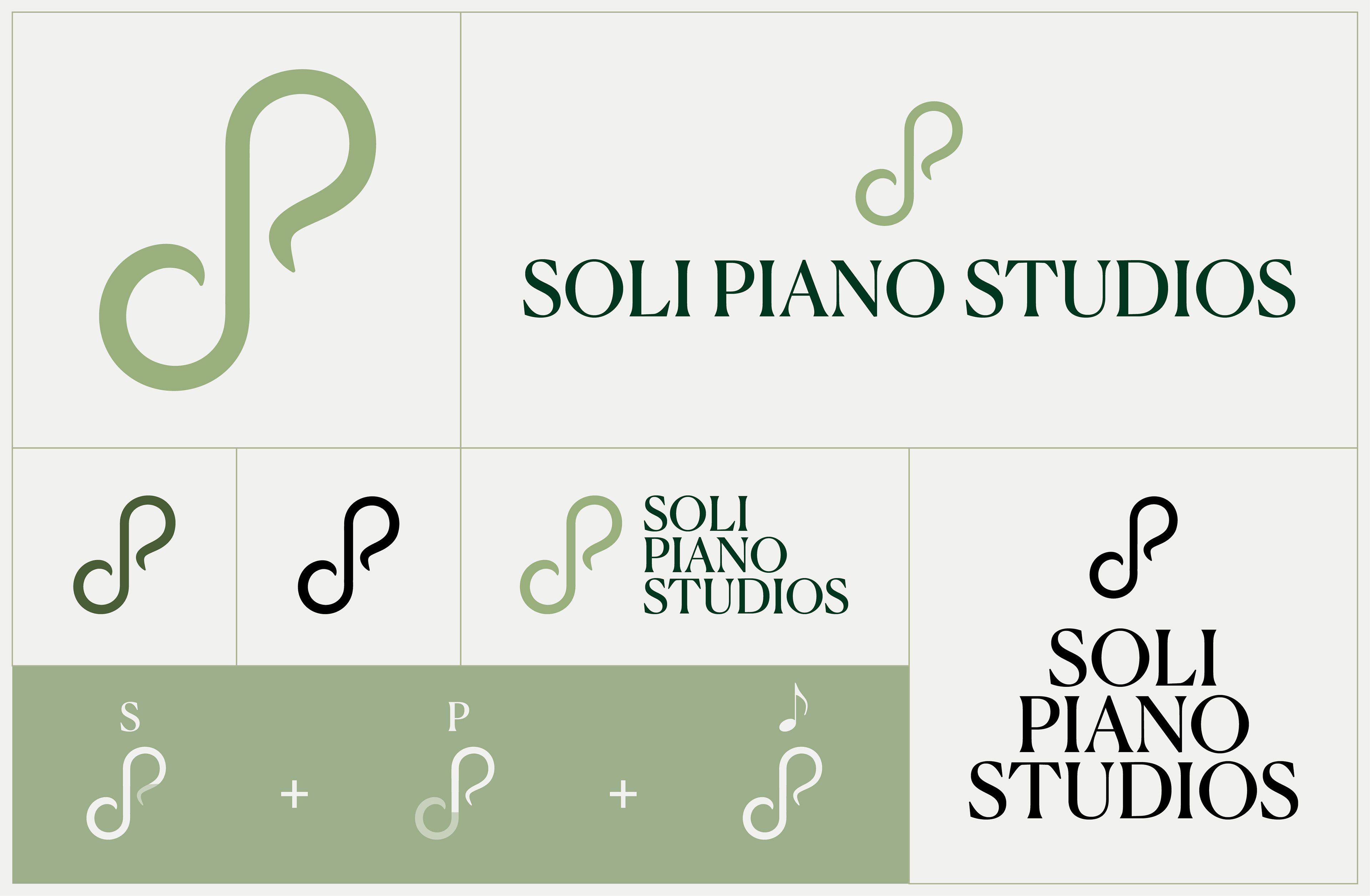
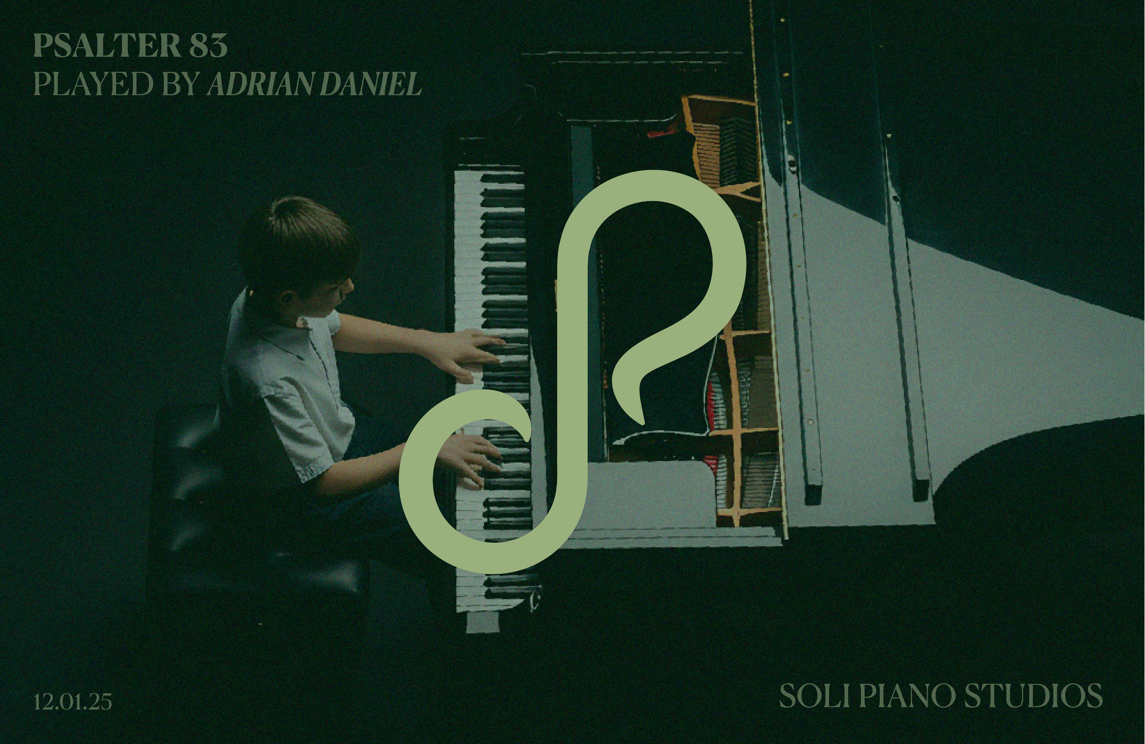
The resulting logo uses minimal forms and gentle curves to suggest movement, rhythm, and flow, echoing the experience of sound rather than illustrating it. By keeping the design restrained and intentional, the identity feels calm and confident, allowing the music and the student to remain at the centre.
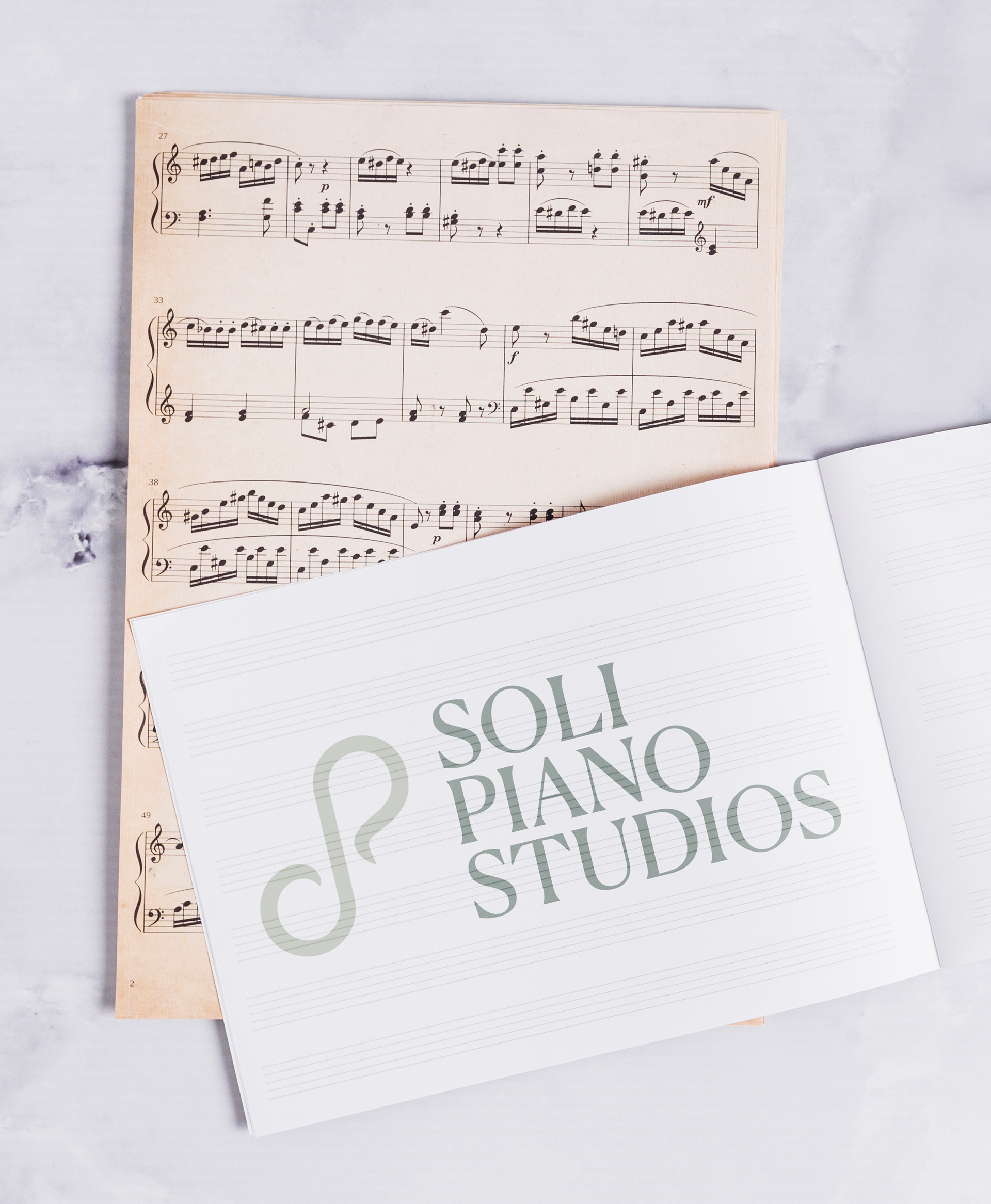
The final mark is versatile and enduring, designed to work seamlessly across lesson materials, digital platforms, and studio signage, while communicating professionalism, warmth, and artistic integrity.
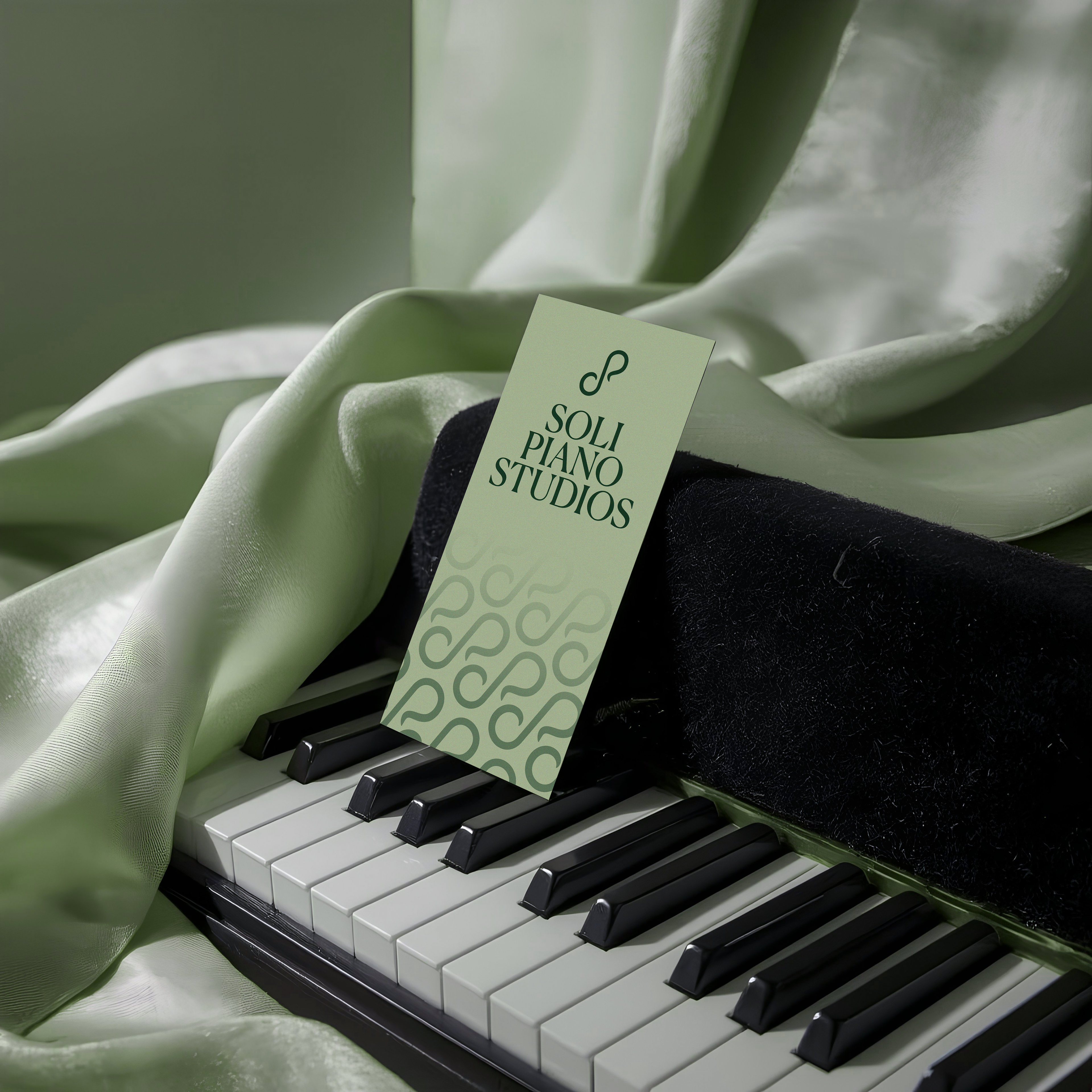
Quietly Composed
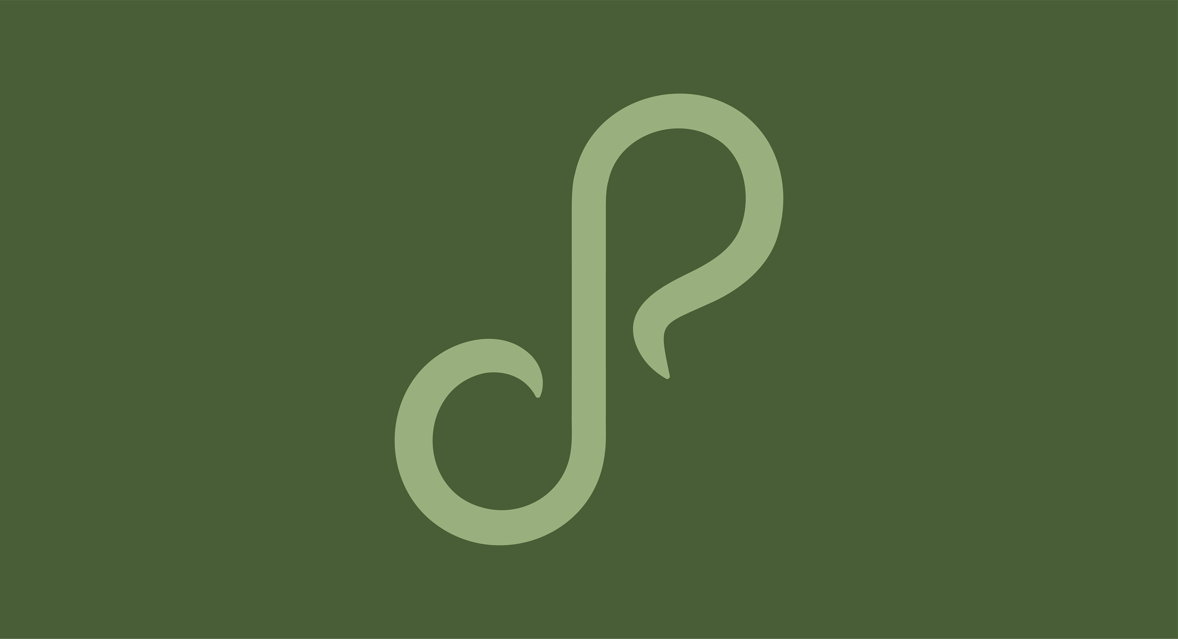
How do we say Soli Piano Studio without spelling it out? We let the music lead. With gentle curves and intentional restraint, the identity captures the flow, discipline, and quiet confidence that define the studio. Nothing is overstated — every line has purpose, every curve reflects movement and expression.
The form echoes the rhythm of sound rather than illustrating an instrument outright, allowing the logo to feel timeless instead of themed. It’s minimal, but never cold. Refined, yet welcoming. A mark that respects the structure of classical training while leaving room for creativity and individuality to emerge.
This isn’t just a logo — it’s a visual expression of focus, artistry, and balance. A design that stays out of the way, so the music can take centre stage.
Thanks for viewing!